做嵌入式的时候用过 LVGL,它的样式系统给我留下了深刻印象。LVGL 的 Border 是”实体”的——会占据布局空间,把内容往里挤。
安卓这边就没这么痛快了。ShapeDrawable 和 MaterialCardView 的边框更像是”装饰品”,想让边框、圆角、内边距各自独立可控?原生组件做起来挺别扭。
所以我干脆手搓了一个 BorderFrameLayout,把 LVGL 那套逻辑搬过来。
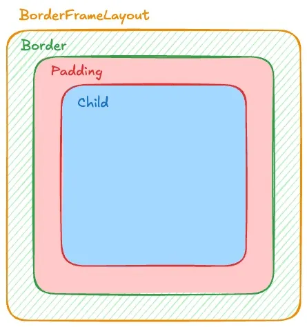 图中不同的颜色代表真实占用的空间。
绿色代表Border, 红色代表内部Padding, 蓝色代表Child可使用空间.
图中不同的颜色代表真实占用的空间。
绿色代表Border, 红色代表内部Padding, 蓝色代表Child可使用空间.
原生方案的几个坑
给 View 加边框,常规做法是写个 shape XML 设成 background。但实际用起来会遇到这些问题:
圆角被子 View 盖住:容器有圆角,子 View 颜色不同时会直接覆盖掉圆角。OutlineProvider 和 clipToOutline 能用,但效果不稳定。
Padding 和 Border 混在一起:想实现”Border 占 2dp,Padding 占 10dp”,得自己算加法。逻辑一复杂就容易出错。
各边独立控制麻烦:只想要底部边框?想要虚线?XML 方案得写一堆文件。
思路:继承 FrameLayout 重写绘制
既然原生不好使,那就自己来。
BorderFrameLayout 把容器边界分成两层:
- Background Path:整个控件的外轮廓(含圆角)
- Child Draw Area:扣掉边框后,子 View 实际可用的区域
Border 就画在这两层中间。
效果展示
为了方便演示效果, 我在BorderFrameLayout内部放置了一个对齐底部的Button. 这个Button的位置会受到Border的尺寸和位置变化的影响产生偏移.
只有底部边框
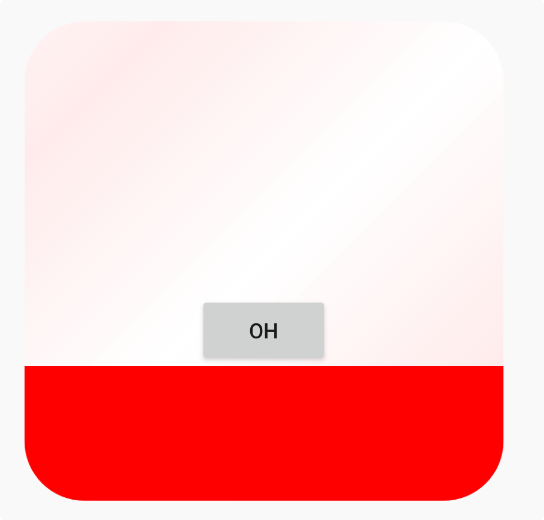 可以看到Button的底部是底部Border,而不是常规的容器底部.
右侧和底部边框(L型)
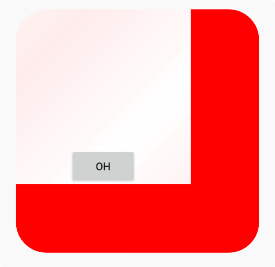 引入右侧Border, Button理所应当的相左产生了些许偏移.
上右下三边虚线边框
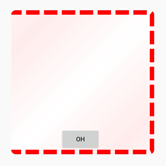 虚线Border效果展示
极端圆角
 当Border圆角设置的十分巨大的并且缺少一条边的Border的时候, 就得到了这个
看上去十分诡异的效果, 但这确实是LVGL里能够设置出来的样式.
当Border圆角设置的十分巨大的并且缺少一条边的Border的时候, 就得到了这个
看上去十分诡异的效果, 但这确实是LVGL里能够设置出来的样式.
单边、多边、虚线、极端圆角都能正确处理。
实现细节
1. 让 Border 参与布局计算
重载 onLayout 和 layoutChildren,把 mBorderWidth 算进子 View 的可用空间:
private fun layoutChildren(left: Int, top: Int, right: Int, bottom: Int) {
    // parentLeft 等边界基于 (padding + border) 计算
    val parentLeft: Int = getPaddingLeftWithForeground()
    val parentRight: Int = right - left - getPaddingRightWithForeground()

    val parentTop: Int = getPaddingTopWithForeground()
    val parentBottom: Int = bottom - top - getPaddingBottomWithForeground()

    for (i in 0 until count) {
        val child = getChildAt(i)
        // 子 View 会被"挤"到 Border 内部
        child.layout(childLeft, childTop, childLeft + width, childTop + height)
    }
}
getPadding 返回的是 mRealPadding + mBorder,让安卓系统以为这就是正常的 Padding:
override fun getPaddingLeft(): Int {
    return (mRealPaddingLeft + mBorderLeft).roundToInt()
}
2. 用遮罩绘制 Border
一开始我试过用 Path + Stroke 的方式内缩边框, 但在多边 + 极端圆角场景下,内外轮廓很难保持一致, 虚线在拐角处尤其明显。
而直接画 Stroke 矩形的话,圆角内外弧度很难对齐。所以最终用的是 PorterDuffXfermode 遮罩方案:
- 画一个全黑的圆角外轮廓
- 用
DST_OUT扣掉中间内容区 - 得到只有边框形状的 Mask
- 用
SRC_IN把 Border 颜色填进去
val maskBitmap = Bitmap.createBitmap(width, height, Bitmap.Config.ALPHA_8)
val maskCanvas = Canvas(maskBitmap)

// 填充外轮廓
maskCanvas.drawPath(mBackgroundPath, mBorderPaint.apply {
    style = Paint.Style.FILL
    color = Color.BLACK
})

// 扣掉内部区域
mBorderPaint.xfermode = PorterDuffXfermode(PorterDuff.Mode.DST_OUT)
maskCanvas.drawPath(generateChildDrawAreaPath(), mBorderPaint)

// 用 Mask 限制 Border 绘制范围
canvas.drawBitmap(maskBitmap, 0f, 0f, mBorderPaint)
mBorderPaint.xfermode = PorterDuffXfermode(PorterDuff.Mode.SRC_IN)
canvas.drawRect(0f, 0f, width.toFloat(), height.toFloat(), mBorderPaint.apply {
    this.color = mBorderColor
})
不管 Border 多宽、圆角多夸张,边缘都能对齐。
3. 虚线边框
在 Mask 阶段加一层 DashPathEffect:
if (mBorderStyle == 1) {
    counterPath.addRoundRect(/* 中间轮廓 */)
    maskCanvas.drawPath(counterPath, mBorderPaint.apply {
        style = Paint.Style.STROKE
        pathEffect = DashPathEffect(
            floatArrayOf(maxDashIntervals, maxDashIntervals * 3),
            0f
        )
    })
}
4. 内容裁剪
防止子 View 覆盖圆角:
override fun dispatchDraw(canvas: Canvas) {
    drawBorderAndBackground(canvas)
    canvas.save()
    if (clipContent) {
        canvas.clipPath(mBackgroundPath)
        canvas.clipPath(generateChildDrawAreaPath())
    }
    super.dispatchDraw(canvas)
    canvas.restore()
}
这种方案在 Border 高频变化时会有一定 Bitmap 重建开销, 更适合样式稳定的容器类组件。
XML 声明式用法
定义自定义属性后可以直接在布局里用:
<?xml version="1.0" encoding="utf-8"?>
<resources>
    <declare-styleable name="BorderFrameLayout">
        <attr name="borderRadius" format="dimension" />
        <attr name="borderWidth" format="dimension" />
        <attr name="borderLeft" format="dimension" />
        <attr name="borderTop" format="dimension" />
        <attr name="borderRight" format="dimension" />
        <attr name="borderBottom" format="dimension" />
        <attr name="borderColor" format="color" />
        <attr name="borderStyle" format="enum">
            <enum name="solid" value="0" />
            <enum name="dash" value="1" />
        </attr>
        <attr name="backgroundGradientAngle" format="float" />
        <attr name="backgroundGradientColor" format="color" />
        <attr name="realPaddingLeft" format="dimension" />
        <attr name="realPaddingTop" format="dimension" />
        <attr name="realPaddingRight" format="dimension" />
        <attr name="realPaddingBottom" format="dimension" />
        <attr name="backgroundColor" format="color" />
        <attr name="clipContent" format="boolean" />
    </declare-styleable>
</resources><io.serialflow.editor.ui.BorderFrameLayout
android:layout_width="200dp"
android:layout_height="200dp"
app:borderRadius="24dp"
app:borderWidth="8dp"
app:borderColor="#FF0000"
app:borderStyle="dash"
app:backgroundColor="#FFEEEE"
app:clipContent="true">
<!-- 子 View 会被自动挤到边框内部 -->
</io.serialflow.editor.ui.BorderFrameLayout>完整代码
package io.serialflow.editor.ui

import android.content.Context
import android.graphics.\*
import android.util.AttributeSet
import android.view.Gravity
import android.widget.FrameLayout
import kotlin.math.PI
import kotlin.math.cos
import kotlin.math.roundToInt
import kotlin.math.sin
import io.serialflow.editor.R

class BorderFrameLayout : FrameLayout {

    private val DEFAULT_CHILD_GRAVITY = Gravity.TOP or Gravity.START
    protected var clipContent: Boolean = true

    private var mBackgroundPath = Path()
    private var mBorderInnerContourPath = Path()

    private var mBorderRadius = 0f
    private var mBorderWidth: Float = 0f

    private var mBorderLeft: Float = 0f
    private var mBorderTop: Float = 0f
    private var mBorderRight: Float = 0f
    private var mBorderBottom: Float = 0f

    private var mRealPaddingLeft: Float = 0f
    private var mRealPaddingTop: Float = 0f
    private var mRealPaddingRight: Float = 0f
    private var mRealPaddingBottom: Float = 0f

    private val mBorderPaint = Paint().apply {
        isAntiAlias = true
        style = Paint.Style.FILL
    }

    private var mBorderColor: Int = Color.TRANSPARENT
    private var mBorderStyle: Int = 0
    private var mBackgroundColor: Int = Color.TRANSPARENT
    private var mBackgroundGradientAngle = 0f
    private var mBackgroundGradientColor = Color.TRANSPARENT
    private val counterPath = Path()

    constructor(context: Context) : this(context, null)
    constructor(context: Context, attrs: AttributeSet?) : this(context, attrs, 0)
    constructor(context: Context, attrs: AttributeSet?, defStyle: Int) : super(
        context, attrs, defStyle
    ) {
        val typedArray = context.obtainStyledAttributes(attrs, R.styleable.BorderFrameLayout, defStyle, 0)

        mBorderRadius = typedArray.getDimension(R.styleable.BorderFrameLayout_borderRadius, 0f)
        mBorderColor = typedArray.getColor(R.styleable.BorderFrameLayout_borderColor, Color.TRANSPARENT)
        if (mBorderColor != Color.TRANSPARENT) {
            mBorderColor = mBorderColor or 0xff000000.toInt()
        }
        mBorderStyle = typedArray.getInt(R.styleable.BorderFrameLayout_borderStyle, 0)

        mBackgroundColor = typedArray.getColor(R.styleable.BorderFrameLayout_backgroundColor, Color.TRANSPARENT)
        mBackgroundGradientAngle = typedArray.getFloat(R.styleable.BorderFrameLayout_backgroundGradientAngle, 0f)
        mBackgroundGradientColor = typedArray.getColor(R.styleable.BorderFrameLayout_backgroundGradientColor, Color.TRANSPARENT)
        clipContent = typedArray.getBoolean(R.styleable.BorderFrameLayout_clipContent, true)

        mRealPaddingLeft = typedArray.getDimension(R.styleable.BorderFrameLayout_realPaddingLeft, 0f)
        mRealPaddingTop = typedArray.getDimension(R.styleable.BorderFrameLayout_realPaddingTop, 0f)
        mRealPaddingRight = typedArray.getDimension(R.styleable.BorderFrameLayout_realPaddingRight, 0f)
        mRealPaddingBottom = typedArray.getDimension(R.styleable.BorderFrameLayout_realPaddingBottom, 0f)

        val borderWidth = typedArray.getDimension(R.styleable.BorderFrameLayout_borderWidth, 0f)
        val borderLeft = typedArray.getDimension(R.styleable.BorderFrameLayout_borderLeft, borderWidth)
        val borderTop = typedArray.getDimension(R.styleable.BorderFrameLayout_borderTop, borderWidth)
        val borderRight = typedArray.getDimension(R.styleable.BorderFrameLayout_borderRight, borderWidth)
        val borderBottom = typedArray.getDimension(R.styleable.BorderFrameLayout_borderBottom, borderWidth)

        typedArray.recycle()
        setBorderWidth(borderLeft, borderTop, borderRight, borderBottom)
    }

    // ... 完整代码见项目源码 ...

}